From v0.8.X to v1.X
This is a brief guide on migrating from Pode.Web v0.8.X to v1.X.
In Pode.Web v1.X all elements are now rendered client-side using JavaScript, rather than server-side using .pode view files. There are still some base view files for HTML boilerplate, but everything else has been migrated. This will help take some load away from the server, and allow element rendering to be more dynamic and "on-the-fly". (ie: a table can now contain any element, not just 5 randomly pre-selected elements).
Module
Initialisation
When you create a new Pode server, and you wish to use the Pode.Web module, you have to first call Use-PodeWebTemplates. Whilst an alias for this function still exists for now, the function itself has been renamed to Initialize-PodeWebTemplates - while not mandatory yet, it is recommended to migrate to the new name, and use in any new scripts.
There is no date as to when Use-PodeWebTemplates will be removed, if at all in v1.X, but it will definitely be removed when a v2 is released.
AutoImport Settings
Due to changes and fixes within the core Pode module itself, around the AutoImport functionality for modules, if you have the following in your server.psd1 file to disable AutoImport for Modules:
@{
    Server = @{
        AutoImport = @{
            Modules = @{
                Enable = $false
            }
        }
    }
}
Then you'll need to change this to the following configuration. This will enable Module AutoImports, but it will restrict it to only allow modules added via Export-PodeModule to be auto-imported - Pode.Web automatically calls this for you, so Pode can appropriately import the Pode.Web module.
@{
    Server = @{
        AutoImport = @{
            Modules = @{
                Enable     = $true
                ExportOnly = $true
            }
        }
    }
}
Actions
Outputs
In Pode.Web v1.X to render a new element(s) on your page you can just call the relevant New-PodeWebX function. This now means the following Out-PodeWebX functions are redundant:
Out-PodeWebTableOut-PodeWebChartOut-PodeWebTextboxOut-PodeWebBreadcrumb
The New-PodeWebX functions for each have been updated so you can more easily switch from one to the other - the only new requirement is that a -Name or -Id is required, and you'll also need to pipe the function into a new Out-PodeElement function. This new latter function is so that Pode.Web can more appropriately append the element to the page - you can also tweak the appending rule to append the element before the "sender".
For example, to output an ad-hoc Table to show some processes via a Form would be:
$form = New-PodeWebForm -Name 'Search Processes' -AsCard -ScriptBlock {
    Get-Process -Name $WebEvent.Data.Name -ErrorAction Ignore |
        Select-Object Name, ID, WorkingSet, CPU |
        New-PodeWebTable -Name 'Output' |
        Out-PodeWebElement
} -Content @(
    New-PodeWebTextbox -Name 'Name'
)
Or the same for a Chart:
$form = New-PodeWebForm -Name 'Top X Processes' -AsCard -ScriptBlock {
    Get-Process |
        Sort-Object -Property CPU -Descending |
        Select-Object -First $WebEvent.Data.Amount |
        ConvertTo-PodeWebChartData -LabelProperty ProcessName -DatasetProperty CPU |
        New-PodeWebChart -Name 'Output' -Type Line |
        Out-PodeWebElement
} -Content @(
    New-PodeWebTextbox -Name 'Amount'
)
Or for a Textbox:
$form = New-PodeWebForm -Name 'Search Processes' -AsCard -ScriptBlock {
    $processes = Get-Process -Name $WebEvent.Data.Name -ErrorAction Ignore |
        Select-Object Name, ID, WorkingSet, CPU

    $processes |
        New-PodeWebTextbox -Name 'Output' -Multiline -Preformat -AsJson -Size ((6 * $processes.Length) + 2) |
        Out-PodeWebElement
} -Content @(
    New-PodeWebTextbox -Name 'Name'
)
Validation
Any references to Out-PodeWebValidation should be updated to Show-PodeWebValidation - no other changes are needed, just a function rename.
Tabs
Any references to Move-PodeWebTab should be updated to Move-PodeWebTabs. This will still do the same logic of moving a Tabs element to the next Tab, but there's now a new -Direction parameter to also cycle to the previous Tab.
Classes
The Add-PodeWebComponentClass and Remove-PodeWebComponentClass action functions have been renamed to Add-PodeWebClass and Remove-PodeWebClass respectively.
The -Class parameter on both has also been renamed to -Value.
Styles
The Set-PodeWebComponentStyle and Remove-PodeWebComponentStyle action functions have been renamed to Add-PodeWebStyle and Remove-PodeWebStyle respectively.
The -Property parameter on both has also been renamed to -Key.
State Parameters
All of the -XState parameters in all Action functions have been migrated to proper switch parameters - which now mirror the Element creation functions appropriately.
For example, the -SizeState parameter on Update-PodeWebButton has been removed and is now the -FullWidth switch - matching the parameter on New-PodeWebButton. Omitting the switch on Update-PodeWebButton will not update -FullWidth; to enable full width buttons supply -FullWidth; and to disable full width supply -FullWidth:$false.
NoForm and NoLabels
In Pode.Web v1.X the new element rendering is more aware if an input element is being rendered within a Form, or not. Because of this the -NoForm and -NoLabels parameters are now all redundant, and have been removed from the following functions:
New-PodeWebTextboxNew-PodeWebFileUploadNew-PodeWebCheckboxNew-PodeWebRadioNew-PodeWebSelectNew-PodeWebRangeNew-PodeWebCredentialNew-PodeWebDateTimeNew-PodeWebMinMax
Elements and Layouts
All elements that can contain other elements, like a Paragraph; Form; or Tab, for example, can now contain any type - since Layouts/Elements are now all one. The only exception is elements that have a specific parent/child relation, such as Accordions can only contain Bellows. Layouts are now just referred to as Elements as well, to simply things.
Because of this change, functions that had -Layouts or -Elements parameters have been renamed to -Content:
New-PodeWebParagraphNew-PodeWebTabAdd-PodeWebPage
Parent Data
Originally, within the scriptblock of a dynamic element, if you wanted to access the data of an element's parent you could do so via $ElementData.Parent. This has now been changed, and the data is accessible via a new $ParentData instead - this has been done to stop the $ElementData object from getting too large, and to reduce network data transfer to better support SSE.
Selects
Select elements have been changed primarily in the way you supply Options. Originally you would create a Select via New-PodeWebSelect and supply -Options as a string array, and optionally -DisplayOptions or -SelectedValue.
Now, you can create Options via the new New-PodeWebOption function - and even group them via New-PodeWebOptionGroup. The -Options on New-PodeWebSelect now accepts an array of these elements, and the -DisplayOptions and -SelectedValue have moved to New-PodeWebOption as -DisplayName and -Selected respectively.
For example, the following previous Select element:
New-PodeWebSelect -Name 'Example' -Options @('Option1', 'Option2') -SelectedValue 'Option1'
Would now be the following instead:
New-PodeWebSelect -Name 'Example' -Options @(
    New-PodeWebOption -Name 'Option1' -Selected
    New-PodeWebOption -Name 'Option2'
)
To assist with most migrations there is a helper function: ConvertTo-PodeWebOption. You can pipe an original raw string array into this, along with an optional -SelectedOption value, and it will convert to strings into Option elements for you:
New-PodeWebSelect -Name 'Example' -Options @(
    'Option1', 'Option2' | ConvertTo-PodeWebOption -SelectedOption 'Option1'
)
The Update-PodeWebSelect action sees the same update as well.
Additionally Set-PodeWebSelect is now Select-PodeWebSelectOption, and the -Value parameter is now -OptionName.
Furthermore, new Actions have been created to Add and Remove Select options; and a new Datalist element has been created as well.
Checkboxes
Checkboxes have seen a similar update to Selects; originally you would create a Checkbox via New-PodeWebCheckbox and supply -Options as a string array, and optionally -DisplayOptions.
Now, you can create Options via the new New-PodeWebOption function. The -Options on New-PodeWebCheckbox now accepts an array of these elements, and the -DisplayOptions parameter has moved to New-PodeWebOption as -DisplayName. Additionally, while an Alias does exist, -Checked has been renamed to -Selected.
For example, the following previous Checkbox element:
New-PodeWebCheckbox -Name 'Example' -Options @('Option1', 'Option2')
Would now be the following instead:
New-PodeWebCheckbox -Name 'Example' -Options @(
    New-PodeWebOption -Name 'Option1' -Selected
    New-PodeWebOption -Name 'Option2'
)
To assist with most migrations there is a helper function: ConvertTo-PodeWebOption. You can pipe an original raw string array into this, and it will convert to strings into Option elements for you:
New-PodeWebCheckbox -Name 'Example' -Options @(
    'Option1', 'Option2' | ConvertTo-PodeWebOption -SelectedOption 'Option1'
)
The Update-PodeWebCheckbox action sees the same update as well - where -OptionId is now -Options, and can be used to overwrite all options for a Checkbox (like you can with a Select)
Additionally Enable-PodeWebCheckbox and Disable-PodeWebCheckbox have had their -OptionId renamed to -OptionName. Instead of referencing an option by its "index", you can now just reference it by the -Name supplied to New-PodeWebOption.
Furthermore, new Actions have been created to Add, Remove, Select, Reset, and Clear Checkbox options.
Radios
Radio elements have seen a similar update to Selects and Checkboxes; originally you would create a Radio via New-PodeWebRadio and supply -Options as a string array, and optionally -DisplayOptions.
Now, you can create Options via the new New-PodeWebOption function. The -Options on New-PodeWebRadio now accepts an array of these elements, and the -DisplayOptions parameter has moved to New-PodeWebOption as -DisplayName.
For example, the following previous Radio element:
New-PodeWebRadio -Name 'Example' -Options @('Option1', 'Option2')
Would now be the following instead:
New-PodeWebRadio -Name 'Example' -Options @(
    New-PodeWebOption -Name 'Option1' -Selected
    New-PodeWebOption -Name 'Option2'
)
To assist with most migrations there is a helper function: ConvertTo-PodeWebOption. You can pipe an original raw string array into this, and it will convert to strings into Option elements for you:
New-PodeWebRadio -Name 'Example' -Options @(
    'Option1', 'Option2' | ConvertTo-PodeWebOption -SelectedOption 'Option1'
)
Furthermore, the Radio elements finally have Update, Add, Remove, Select, etc. Actions - akin to Checkboxes.
Classes and Styles
All element functions have had the -CssClass and -CssStyle parameters removed. Instead, you can now pipe the element into either Add-PodeWebClass or Add-PodeWebStyle:
# add a class to an element
New-PodeWebTextbox -Name 'Example' |
    Add-PodeWebClass -Value 'my-custom-textbox'

# add a style to an element
New-PodeWebTextbox -Name 'Example' |
    Add-PodeWebStyle -Key 'color' -Value 'yellow'
Component to Element
Originally there was a differentiation between Layouts and Elements in Pode.Web, but this is now being dropped and everything is just an "Element". Because of this, the "Component" catch-all name is also being dropped, which means the following action functions are being renamed:
| From | To |
|---|---|
Hide-PodeWebComponent |
Hide-PodeWebElement |
Show-PodeWebComponent |
Show-PodeWebElement |
Add-PodeWebComponentClass |
Add-PodeWebClass |
Remove-PodeWebComponentClass |
Remove-PodeWebClass |
Set-PodeWebComponentStyle |
Add-PodeWebStyle |
Remove-PodeWebComponentStyle |
Remove-PodeWebStyle |
The parameters of these functions remain unchanged.
Events
The -Component parameter on Register-PodeWebEvent and Register-PodeWebMediaEvent has also been renamed to -Element. This is usually passed via piped input so shouldn't affect anyone too much.
ReadOnly and Disabled
In some places the ReadOnly/Disabled parameters were being used as if they were the same thing - these have been split out into two different parameters. Because of this split, the -ReadOnly parameter on New-PodeWebSelect is now -Disabled, and its counterpart of Update-PodeWebSelect has had its -ReadOnly parameter renamed to -Disabled as well.
Icons
Login Page
This was already deprecated previously in in v0.X release, but: the old -Icon and -IconUrl aliases, for -Logo and -LogoUrl respectively, have now been removed on Set-PodeWebLoginPage.
Notifications
The -Icon parameter on Show-PodeWebNotification has been renamed to -IconUrl - to signify that it's not a Material Design Icon, but instead a URL path to an image file.
Comments
The -Icon parameter on New-PodeWebComment has been renamed to -AvatarUrl - to signify that it's not a Material Design Icon, but instead a URL path to an image file.
Home Page
In Pode.Web v1.X it is possible to set custom paths on Add-PodeWebPage. Because of this, the Set-PodeWebHomePage function has been removed, as you can now use Add-PodeWebPage to create a page at the root path via -Path '/'. This also means you could have a Home Page at any custom path you require.
The Home Page in Pode.Web is still a "special" kind of system page - used by Login page redirects and the header icon. Therefore, if you create a Home Page using Add-PodeWebPage it's recommended to flag it as such by supplying the new -HomePage switch.
For example, if you currently have a Set-PodeWebHomePage setup similar to the below:
Set-PodeWebHomePage -Content $section -Title 'Awesome Homepage'
You can do the same setup now with Add-PodeWebPage:
Add-PodeWebPage -Name 'Home' -Path '/' -Content $section -Title 'Awesome Homepage' -HomePage
In principle, all of the parameters on Set-PodeWebHomePage should map over 1-to-1 on Add-PodeWebPage, but you'll need to additionally supply -Name 'Home' -Path '/' -HomePage to Add-PodeWebPage as well.
The quickest way for most implementations will be to replace all occurrences of Set-PodeWebHomePage with Add-PodeWebPage -Name 'Home' -Path '/' -HomePage.
Default Root Page
Before v1.X, when Use-PodeWebTemplates (now Initialize-PodeWebTemplates) was called it would set up an empty root (/) page for you as the Home Page - meaning you were always forced to have a "Home" page in the sidebar. In v1.X this is no longer the case, a default root Home page is no longer automatically configured.
If you would like to have a default root page still set up, but simply redirect the user to the first available page, you can use the new -RootRedirect on Initialize-PodeWebTemplates. This switch will simply set up a behind-the-scenes root for redirection, and will not appear as a "Home" page on your sidebar.
Links
The -Source parameter on New-PodeWebLink has been renamed to -Url.
Pode.Web Static Content
This next change should in theory only apply to Pode.Web itself, however, the static content route that Pode.Web used to load images/etc. has changed from /pode.web to /pode.web-static. If by chance you are using Pode.Web's static content in any of your pages, this is one change to be aware of in case some content stops loading correctly.
Themes
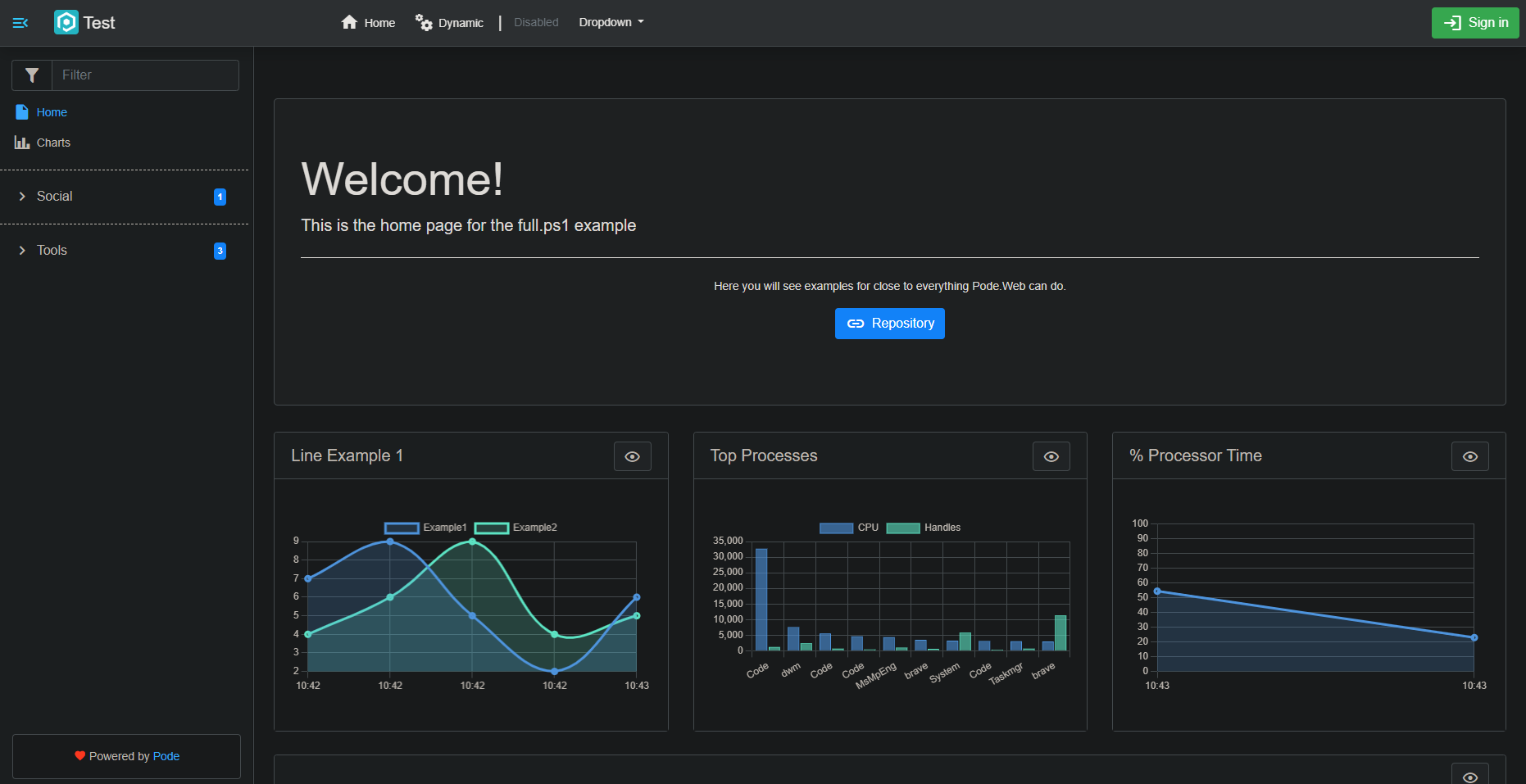
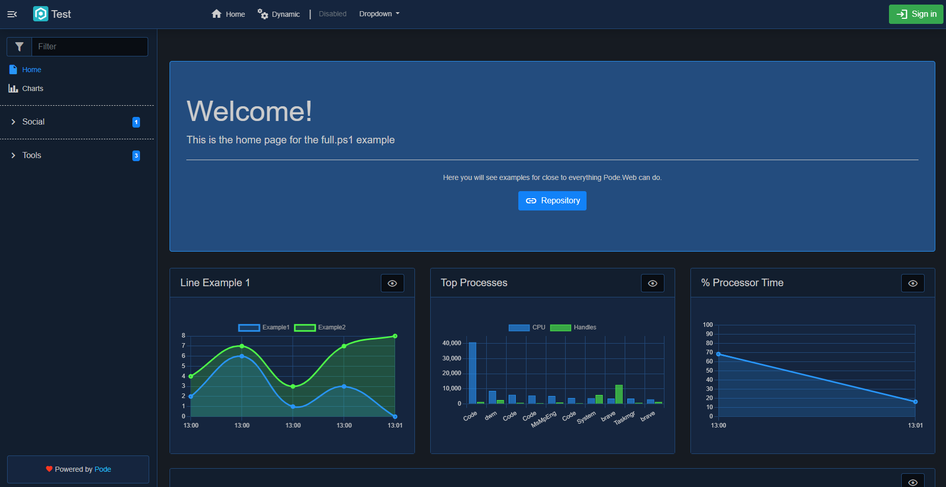
The original Dark theme has now been renamed to "Midnight", and the Dark theme has now been replaced with a proper dark theme:
Code Editor
The themes for New-PodeWebCodeEditor have been changed:
| Old | New |
|---|---|
| vs | Light |
| vs-dark | Dark |
| hc-black | HighContrast |
Form Buttons
In previous versions of Pode.Web the "Submit" button was always visible, and you could optionally show a "Reset" button using the -ShowReset switch on New-PodeWebForm.
Now though, the -ShowReset switch has been removed and a new -ButtonType parameter has been added. This parameter accepts one or more of the following values:
- None
- Submit
- Reset
With "Submit" being the default value if nothing is supplied. Following are some examples:
# default submit button:
New-PodeWebForm -Name 'Example' -Content @() -ScriptBlock {}

# if you want a Form with a Submit and Reset button:
New-PodeWebForm -Name 'Example' -ButtonType Submit, Reset -Content @() -ScriptBlock {}

# if you want a Form with just a Reset button:
New-PodeWebForm -Name 'Example' -ButtonType Submit, Reset -Content @() -ScriptBlock {}

# if you want a Form with no buttons:
New-PodeWebForm -Name 'Example' -ButtonType None -Content @() -ScriptBlock {}
Modal Buttons
Similar to Forms above: in previous versions "Close" button was always visible, and the "Submit" button was always visible if you supplied a -ScriptBlock. If you had a -ScriptBlock but didn't want the "Submit" button then this wasn't possible.
Now though, there is a new -ButtonType parameter on New-PodeWebModal which accepts one or more of the following values:
- None
- Submit
- Reset
- Close
with "Close" being the default with no -ScriptBlock, and "Submit" & "Close" being the default if you supplied a -ScriptBlock, and you don't supply a value for -ButtonType. Following are some examples:
# default close and no scriptblock
New-PodeWebModal -Name 'Example' -Content @()

# default close/submit and scriptblock
New-PodeWebModal -Name 'Example' -AsForm -Content @() -ScriptBlock {}

# scriptblock with only submit and reset
New-PodeWebModal -Name 'Example' -ButtonType Submit, Reset -AsForm -Content @() -ScriptBlock {}

# scriptblock with no buttons
New-PodeWebModal -Name 'Example' -ButtonType None -AsForm -Content @() -ScriptBlock {}
Sidebar
Groups
Separator Line
The dotted line that appeared above Group names in the sidebar is now hidden by default. To have the line be shown you need to initialise the Group using New-PodeWebPageGroup, before you reference the Group on Add-PodeWebPage.
When initialising the Group, using -PassThru and pipe the group's metadata into the new Show-PodeWebSidebarSeparator and the line will be displayed.
New-PodeWebPageGroup -Name Tools -PassThru |
    Show-PodeWebSidebarSeparator
Furthermore, the same can be done for Add-PodeWebPage, to show separators Before - or After - specific pages in the sidebar.
Add-PodeWebPage -Name ExamplePage -Etc -PassThru |
    Show-PodeWebSidebarSeparator -Position After
Page Counter
In previous versions of Pode.Web the Groups always showed the Page count by default in the sidebar. This counter is now hidden by default and the -NoCounter switch has been removed; it is now a -ShowCounter switch instead.