Textbox
| Support | |
|---|---|
| Events | Yes |
A textbox element is a form input element; you can render a textbox, single and multiline, to your page using New-PodeWebTextbox.
A textbox by default is a normal plain single lined textbox, however you can customise its -Type to Email/Password/etc. To change the textbox to be multilined you ca supply -Multiline.
Textboxes also allow you to specify -AutoComplete values.
Single
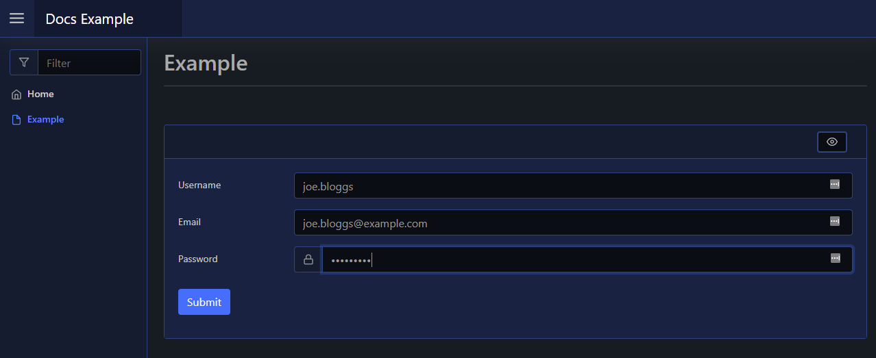
A default textbox is just a simple single lined textbox. You can change the type to Email/Password/etc using the -Type parameter:
New-PodeWebCard -Content @(
    New-PodeWebForm -Name 'Example' -ScriptBlock {
        $username = $WebEvent.Data['Username']
        $email = $WebEvent.Data['Email']
        $password = $WebEvent.Data['Password']
    } -Content @(
        New-PodeWebTextbox -Name 'Username'
        New-PodeWebTextbox -Name 'Email' -Type Email
        New-PodeWebTextbox -Name 'Password' -Type Password -PrependIcon Lock
    )
)
Which looks like below:

AutoComplete
For a single textbox, you can supply autocomplete values via a scriptblock passed to -AutoComplete. This scriptblock should return an array of strings, and will be called once when the textbox is initially loaded:
New-PodeWebCard -Content @(
    New-PodeWebForm -Name 'Example' -ScriptBlock {
        $svcName = $WebEvent.Data['Service Name']
    } -Content @(
        New-PodeWebTextbox -Name 'Service Name' -AutoComplete {
            return @(Get-Service).Name
        }
    )
)
Which looks like below:

Multiline
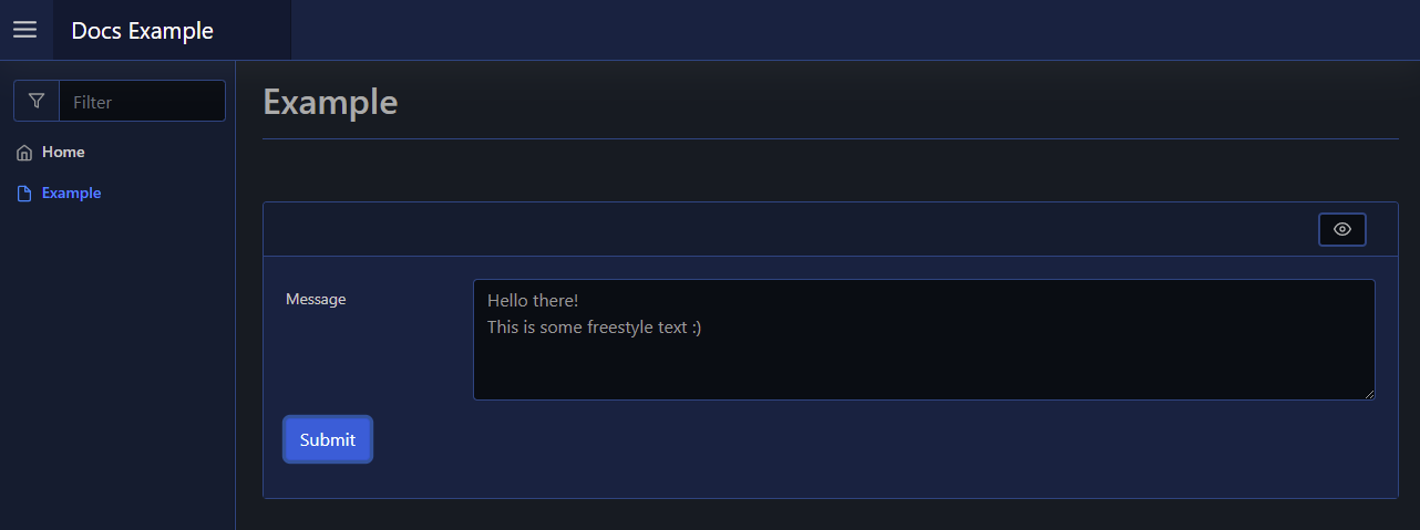
A mutlilined textbox can be displayed by passing -Multiline. You cannot change the type of this textbox, it will always allow freestyle text:
New-PodeWebCard -Content @(
    New-PodeWebForm -Name 'Example' -ScriptBlock {
        $message = $WebEvent.Data['Message']
    } -Content @(
        New-PodeWebTextbox -Name 'Message' -Multiline
    )
)
Which looks like below:

By default it shows the first 4 lines of text, this can be altered using the -Size parameter.
Inline
You can render this element inline with other non-form elements by using the -NoForm switch. This will remove the form layout, and render the element more cleanly when used outside of a form.
Display Name
By default the label displays the -Name of the element. You can change the value displayed by also supplying an optional -DisplayName value; this value is purely visual, when the user submits the form the value of the element is still retrieved using the -Name from $WebEvent.Data.
Size
The -Width of a textbox has the default unit of %. If 0 is specified then auto is used instead. Any custom value such as 100px can be used, but if a plain number is used then % is appended.
The -Height of the textbox is how many lines are displayed when the textbox is multilined.