Card
| Support | |
|---|---|
| Events | No |
A card is an element that renders with an optional title, and can be collapsed by the end-user.
A card takes an array of elements via -Content.
Usage
To create a card element you use New-PodeWebCard, and supply it an array of -Content.
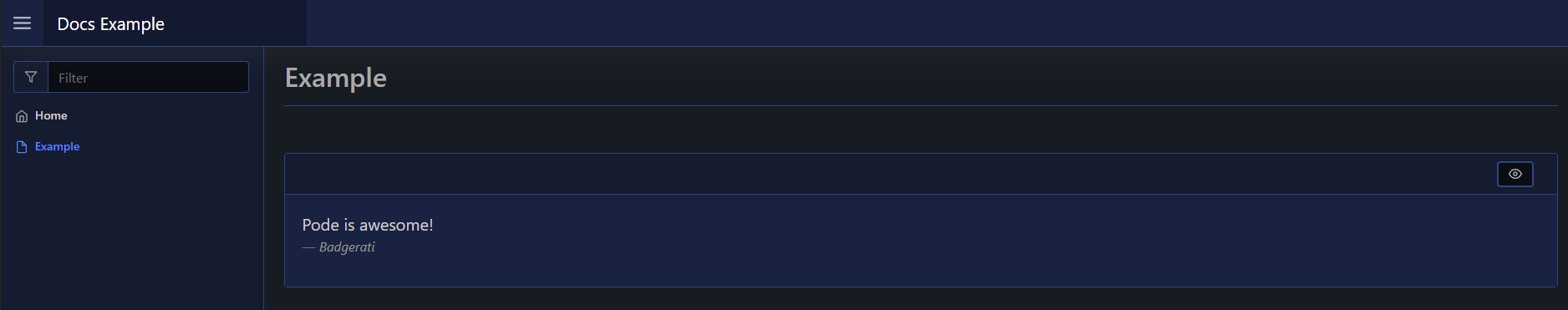
For example, the below renders a card with a quote:
New-PodeWebCard -Content @(
    New-PodeWebQuote -Value 'Pode is awesome!' -Source 'Badgerati'
)
Which would look like below:
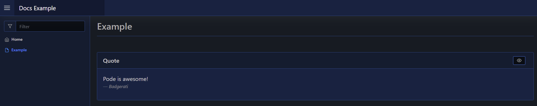
Or with a title:
New-PodeWebCard -Name 'Quote' -Content @(
    New-PodeWebQuote -Value 'Pode is awesome!' -Source 'Badgerati'
)
Which would look like below:
Buttons
By default, the only button in a Card's header is the visibility toggle - to hide or show the Card's contents. You can add custom buttons to a Card's header by supplying New-PodeWebButton or New-PodeWebButtonGroup elements to the -Buttons parameter:
New-PodeWebCard -Name 'Example' -Content @(
    New-PodeWebTextbox -Name 'Name'
) `
-Buttons @(
    New-PodeWebButtonGroup -Buttons @(
        New-PodeWebButton -Name 'Hide' -ScriptBlock {
            Hide-PodeWebElement -Name 'Name' -Type 'Textbox'
        }
        New-PodeWebButton -Name 'Show' -ScriptBlock {
            Show-PodeWebElement -Name 'Name' -Type 'Textbox'
        }
    )

    New-PodeWebButton -Name 'Update' -ScriptBlock {
        Update-PodeWebTextbox -Name 'Name' -Value 'Some random text'
    }
)